Little Sister Creative
In collaboration with and under the direction of Natalie Soud-Cobb, Interior Worlds
Brand Strategy & Design
Identity, Printed Materials, Website Design
current/in progess
Little Sister Creative (LSC) is an artistic, highly attuned and inventive studio that creates meaningful and delightfully joyful experiences for couples in love and brands. The team at Little Sister Creative is a creative force with larger-than-life personality and vision that consistently aims to reflect their clients’ unique ideas and desires. After a few years of growth, they found themselves in need of a rebrand which would speak to the sophistication of their well-tuned, process-oriented point of view while conveying an out-of-the-box, joyful approach filled with fun.

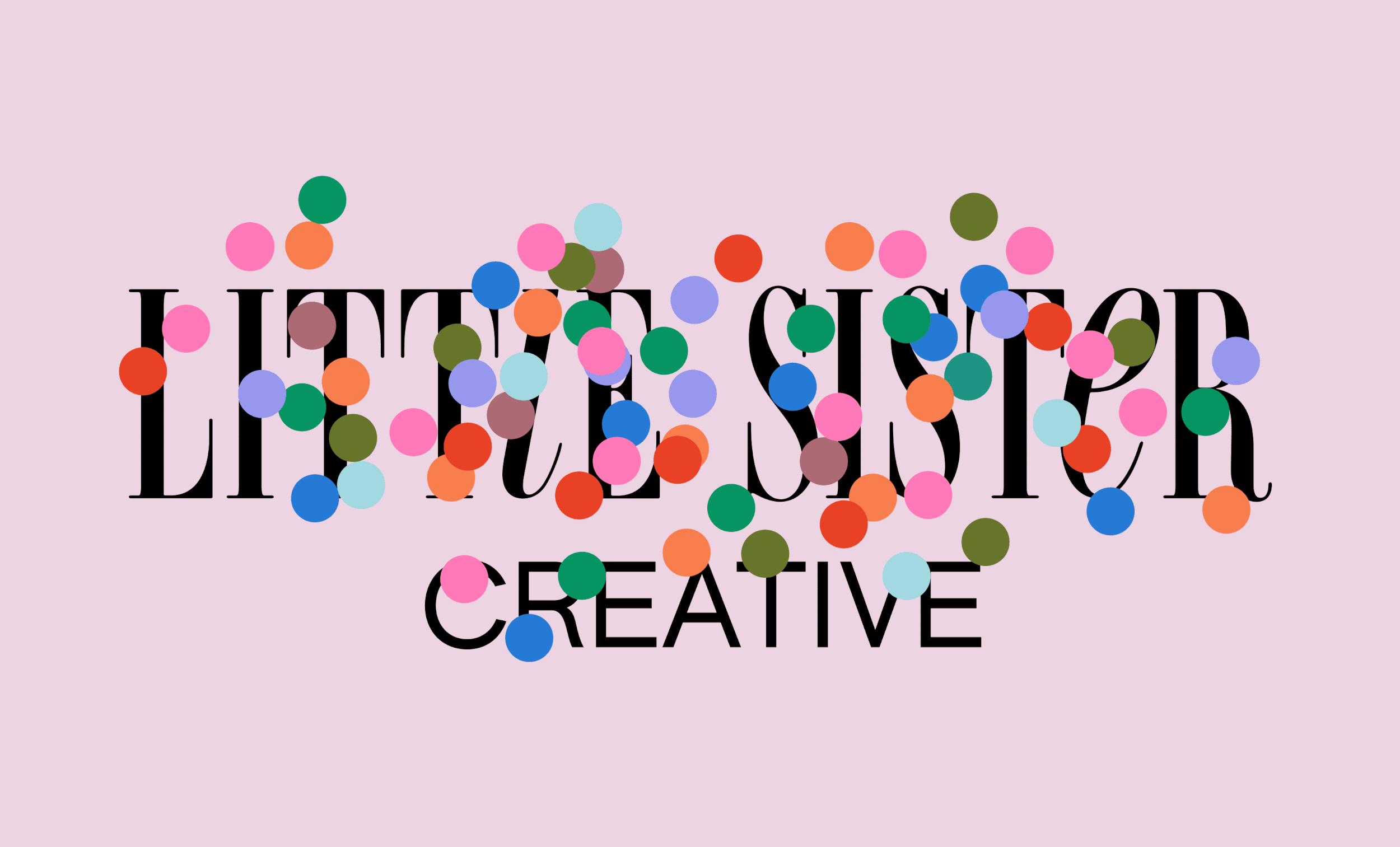
The client came to the process with a specific typographic style they wanted to incorporate with their brand. The main logotype for “Little Sister” is a tall, vertical serif with long, dramatic terminals—reminiscent of a 90’s editorial style. The ‘i’ and ‘e’ as lowercase forms with the addition of animated tittles help add a “wink” to the overall brand, softening the formality of a refined and sophisticated logotype.

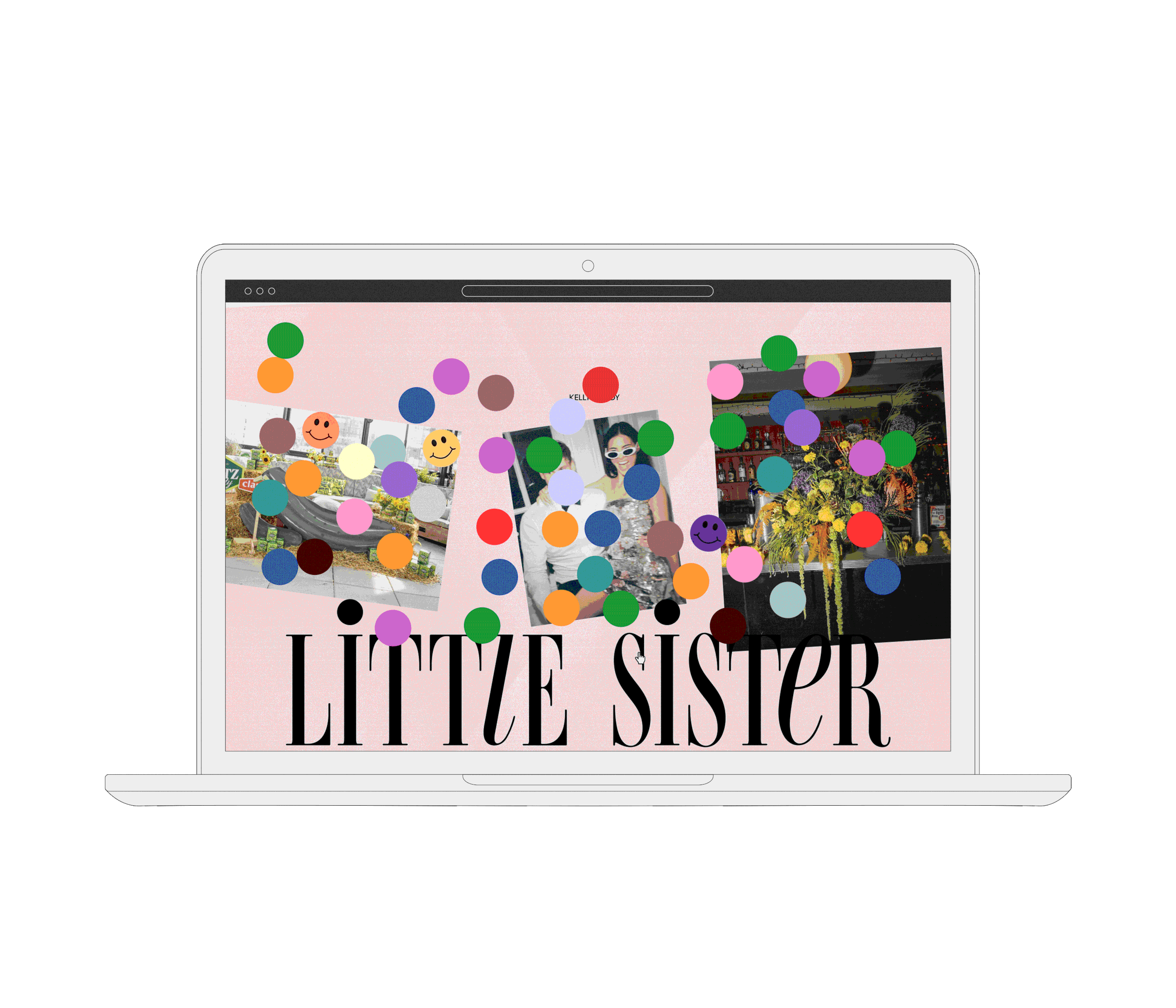
The immersive and joyful experiences that Little Sister provides my inspiration to explore how that could be emulated via animation and their website interactions. To help capture that visceral feeling of fun and celebration, this homepage mockup uses one of their recurring motifs of confetti to exuberantly welcome visitors.